 In an age of smart everything – connected homes, self-driving cars, and AI chips – designing for the user experience has become more challenging than ever.
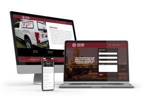
At its core, a mobile-optimized website is about giving users of smartphones and tablets unprecedented, seamless access to the digital world. Beyond exemplifying the essence of smartphones, it all boils down to an individual user’s experience with the digital world you’re inviting and immersing them into.
Put simply, mobile responsiveness carries many advantages to today’s tech-oriented audience, which in turn positively impacts brands. Give your users less than that, and you may not be able to grab their attention and gain the traction your business needs.
Mobile Responsive Design: The Basics
Uniformity and seamlessness are the core principles that inform responsive web design (RWB).
The fluid grid, a template that mobile-focused web designers now fully embrace, offers more dynamism and is attuned to the preferences of online visitors, regardless of the screen size, or whether the command is a touch or click. RWB also takes visual hierarchy into careful consideration, so that when the elements shuffle around the screen, content will flow smoothly from one device to another.
On top of providing great user experience, an RWB strategy is much easier to implement, yields positive ROI, and is future-proof. The fluid grid layout is also flexible enough for continuous enhancement, which translates to less time, effort, and money spent on redesigning.
Best Practices for Mobile UX
Fluidity
Josh Clark, a senior writer for HowStuffWorks.com and co-host of the acclaimed podcast “Stuff You Should Know,” writes that content is like water, equating the concept to a Bruce Lee quote: “You put water into a cup, it becomes the cup. You put water into a bottle, it becomes the bottle. You put it in a teapot, it becomes the teapot.” This is the guiding thought behind responsive web design. Because digital content is accessible from various screen sizes and resolutions, you’d want to achieve a level of fluidity that’s as good as water.
An ideal mobile experience is when the website’s content automatically fits in the available browser space and arranges itself for the user’s convenience. But you shouldn’t just focus on optimizing the website for the browser window. Achieving true responsive design requires a deep understanding of the users.
Speed
Speed is another vital ingredient in offering the best user experience. A KissMetrics report concludes that users would wait only up to 10 seconds for a site to load. Anything beyond that and they’ll abandon the site. In other words, delays impact customer satisfaction and conversions. Moreover, other loading problems, such as page errors, are a good enough reason to leave the site and never come back.
Context-Based Performance
An emphasis on context is now more important than ever, especially that Google has introduced context into its list of quality signals for ranking websites. From visuals to text, every element should display—at a glance—the brand’s identity and why visitors should stick around and scroll further.
Mobile-First Breakpoints
In RWB, breakpoints refer to the point where a website’s content will respond to the user and deliver the best possible layout for consuming information. While it’s vital that you design for different screen sizes and resolutions, the wisest move is to adopt a mobile-first, smallest-screen approach when setting a breakpoint and optimizing content. Think “big screen” once you’ve established that.
SEO-Friendliness
Google has also made the move to adopt a mobile-first mindset across the board, and that can only mean that RWB will get you to the search engine giant’s good graces. Beyond stunning visuals and fluid content, authority and credibility are still vital elements of a mobile website.
Mobile responsive design is what you make of it, with careful attention to details and consideration of these guiding principles. Design with better aim, purpose, and results in mind and you’ll have a website and content as fluid as water.
To know more about this exciting arena of web design, contact Sievers Creative today. We’re more than happy to share what we know.