 According to a Google study, mobile search has overtaken desktop search. With more people browsing websites using their smartphones, responsive web design is no longer an option. This approach to web design, in fact, is now a necessity, as it can affect the rankings of a site.
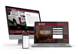
When your website is mobile responsive, it displays well even when the user changes the size of the browser or views the contents of your site on a mobile device. If you haven’t switched to responsive web design, it’s ideal that you do so as soon as you can. Here are SEO benefits you can reap when you make that shift.
Better Site Usability
When Google checks the value of a website to the user, one of the elements it considers is time on page. Visitors who are unable to navigate the site easily are unlikely to explore the web pages further.
By making your website mobile responsive, you make it a breeze for users to navigate your web pages. This leads to longer time on-page and better user experience. Given that search engines view user experience and time on page as important ranking factors, they won’t hesitate to reward sites with mobile responsive web design.
Lower Bounce Rate
Besides time on page, Google also pays attention to bounce rate, which represents the percentage of visitors who enter and then leave your website instead of continuing to explore other pages within the site. The search engine giant may adjust the search engine rankings of your website negatively if its bounce rate is high.
Design plays a significant role in a site’s bounce rate. Visitors will leave websites quickly if they are hard to navigate. Converting to a responsive web design displays the content of your site in a mobile-friendly format. Visitors will then locate the information they need minus the distraction caused by unresponsive design.
Faster Page Speed
Search engines favor sites that load in a matter of seconds, as this delivers excellent user experience and helps increase rankings. Slow-loading websites frustrate users and usually rank poorly in the search results. Sites that are mobile responsive, on the other hand, generally load quicker, especially on mobile devices.
Improved Backlink Profile
Responsive web design enhances the profile of your backlinks, as you are establishing links to just one domain rather than spending your time building up domains. Plus, this web design approach makes it easier for other sites to link to your website. They need not guess on picking the right URL.
Increased Social Sharing
Mobile-responsive websites encourage mobile users to share the content they find on your site on social media. Visitors will easily see social sharing buttons that make it easy for them to share content.
The number of web users favoring mobile browsing over website browsing will rise — and now is perfect to make your website mobile responsive. If you need assistance with web design, don’t hesitate to turn to Sievers Creative. We are a reliable Minnesota web design service provider that optimizes sites for all screen sizes and platforms. Count on our talented team to design and build with all visitors in mind.
Get in touch with us today.